Curated Font Comparisons
Explore hand-picked comparisons of popular fonts. These pairs represent common design decisions faced by UI designers, developers, and typographers.
UI & Product Sans-Serif
Inter vs Roboto


"The most-searched comparison on the web. Both dominate UI design."
Inter vs DM Sans

"Two modern, neutral UI fonts with very similar goals."
Lato vs Open Sans

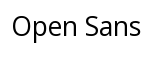
"Classic rivalry — both are safe, friendly, widely used."
Poppins vs Nunito


"Both geometric and rounded; designers constantly choose between them."
Manrope vs Outfit


"Two rising modern sans-serifs popular in SaaS and startup branding."
Work Sans vs Mulish
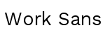

"Similar weight range and personality, common in dashboards and apps."
Plus Jakarta Sans vs Figtree
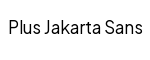
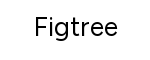
"Fresh geometric UI fonts often considered interchangeable."
IBM Plex Sans vs Source Sans 3
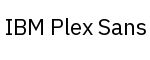

"Both are corporate open-source sans-serifs designed for readability."
Rubik vs Jost


"Rounded-corner geometric fonts popular in consumer products."
Public Sans vs Libre Franklin


"Public Sans was inspired by Franklin Gothic; a natural comparison."
Hanken Grotesk vs Albert Sans


"Two newer grotesques with a clean, minimal character."
Instrument Sans vs Onest


"Both positioned as refined alternatives to standard UI fonts."
Urbanist vs Sora


"Geometric, wide-spaced sans-serifs popular in modern landing pages."
Nunito Sans vs Quicksand
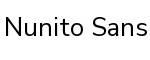

"Both are round-edged, friendly sans-serifs used in apps for younger audiences."
Montserrat vs Raleway
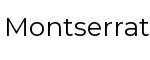

"Two popular geometric-inspired display/UI fonts — elegance vs. boldness."
Lexend vs Atkinson Hyperlegible


"Both specifically designed to improve readability for all users."
Body Serif
Merriweather vs Lora

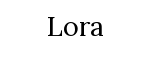
"The most debated body serif pairing — both designed for screens."
Crimson Text vs Crimson Pro
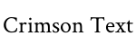
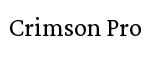
"Direct evolution — Crimson Pro is the refined successor."
Source Serif 4 vs PT Serif

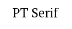
"Both are screen-optimized serifs from major type design programs."
Libre Baskerville vs Baskervville
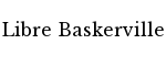
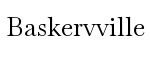
"Both are open-source takes on the classic Baskerville design."
EB Garamond vs Cormorant Garamond
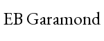
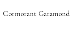
"Two interpretations of Garamond — more classic vs. more expressive."
Bitter vs Arvo
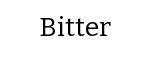

"Two slab serifs with similar weights; popular for editorial body text."
Spectral vs Literata
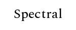
"Both designed specifically for long-form reading on screens."
Vollkorn vs Gentium Plus

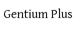
"Two book-weight serifs with broad character support."
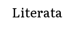
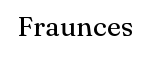
Young Serif vs Fraunces
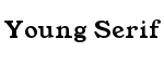
"Two newer optical serifs with expressive personalities."
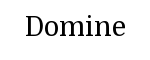
Newsreader vs Domine

"Both aimed at editorial and news reading contexts."
Display & Heading Sans-Serif
Bebas Neue vs Oswald


"The two most popular condensed display sans-serifs — very common comparison."
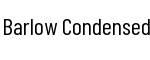
Anton vs Barlow Condensed

"Anton is more aggressive; Barlow is more versatile — designers choose often."
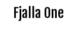
Fjalla One vs Archivo Black

"Both bold, confident headline fonts with similar weight and presence."
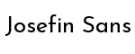
League Spartan vs Josefin Sans

"Geometric, high-impact display fonts with different finishing details."
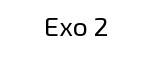
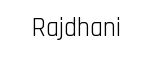
Exo 2 vs Rajdhani
"Both are tech-influenced, multi-weight display sans-serifs."
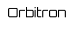
Unbounded vs Orbitron

"Futuristic, wide display fonts — popular for tech brands and gaming."
Kanit vs Saira


"Wide, strong sans-serifs with Latin and extended script support."
Space Grotesk vs DM Sans
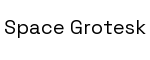
"Space Grotesk has more personality; DM Sans is more neutral — common trade-off."
Editorial & Fashion Serif
Playfair Display vs Cormorant Garamond
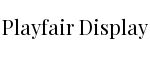
"Two of the most popular elegant serifs — widely compared for editorial use."
Playfair Display vs DM Serif Display

"Both are high-contrast display serifs; DM Serif is more restrained."
Bodoni Moda vs Libre Bodoni
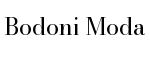
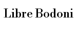
"Two open-source takes on Bodoni — fashion and luxury branding staple."
Marcellus vs Cinzel
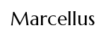
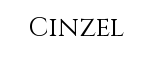
"Both inspired by classical inscriptions; Roman elegance with different warmth."
Yeseva One vs Playfair Display

"Yeseva One is bolder and more dramatic; a frequent alternative."
GFS Didot vs Bodoni Moda
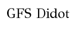
"Two Didone (high-contrast) serifs with different national influences."
Unna vs Vidaloka
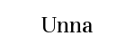

"Two understated, high-quality display serifs suited for editorial titles."
Monospace & Code
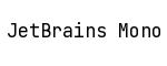
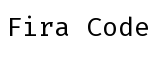
JetBrains Mono vs Fira Code
"The #1 developer font debate — both have ligature support."
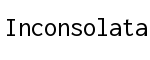
Source Code Pro vs Inconsolata

"Two classic open-source mono fonts with broad adoption."
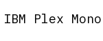
IBM Plex Mono vs Roboto Mono

"Both are corporate-designed mono fonts with distinctive personalities."
DM Mono vs Space Mono

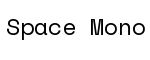
"DM Mono is neutral; Space Mono has a retro quirky character."
Courier Prime vs Cutive Mono
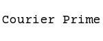
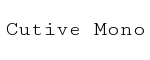
"Both are modern takes on the classic Courier typewriter aesthetic."
Azeret Mono vs Sometype Mono


"Two newer monospaces with geometric construction and modern feel."
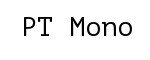
Fira Mono vs PT Mono
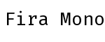
"Two readable, neutral mono fonts suited for terminals and docs."
Victor Mono vs JetBrains Mono
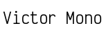
"Victor Mono has cursive italics — a meaningful stylistic difference."
Slab Serif
Roboto Slab vs Zilla Slab
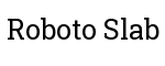
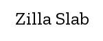
"Two modern, versatile slabs — Roboto Slab is more neutral, Zilla more distinctive."
Crete Round vs Aleo


"Both are rounded slabs with a friendly, approachable tone."
Arvo vs Rockwell-style
"Arvo is the most-used open Rockwell alternative."
Josefin Slab vs Antic Slab
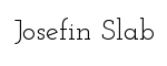
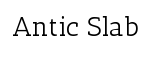
"Both are geometric slabs with a vintage, poster-like quality."
Bree Serif vs Rokkitt

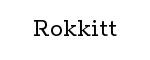
"Both are friendly, versatile slab serifs for medium-weight use."
Podkova vs Kameron
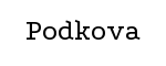
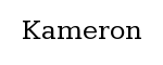
"Two sturdy slabs with Eastern European design origins."
Humanist & Friendly Sans
Cabin vs Karla


"Both humanist sans-serifs with a subtle warmth, often compared."
Overpass vs Oxygen


"Two open-source humanist fonts aimed at screen legibility."
Ubuntu vs Cantarell


"Both originate from Linux desktop environments — a natural rivalry."
Muli vs Karla
"Two lightweight humanist fonts with minimal contrast."
Dosis vs Varela Round


"Both lightweight, rounded, with a clean contemporary feel."
Asap vs Fira Sans


"Both versatile, wide-ranging weight humanist families."
Script & Handwriting
Dancing Script vs Pacifico
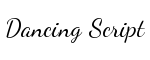

"Both are casual scripts — elegant-flowing vs. retro-rounded."
Lobster vs Pacifico

"Two iconic display scripts — Lobster is more formal, Pacifico more playful."
Great Vibes vs Tangerine

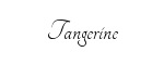
"Two formal calligraphic scripts often used in wedding and luxury branding."
Sacramento vs Pinyon Script

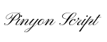
"Both are thin, elegant formal scripts used in invitations."
Caveat vs Kalam


"Two handwritten fonts with a casual, authentic pen feel."
Patrick Hand vs Indie Flower
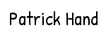

"Both simulate hand-printed lettering — common in educational design."
Satisfy vs Courgette


"Both are script fonts with a mid-weight, flowing character."
Yellowtail vs Lobster Two

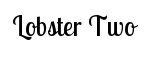
"Retro display scripts — broad strokes and vintage lettering feel."
Classic Heading + Body Pairings
Playfair Display vs Lato
"One of the most recommended heading+body pairings on the web."
Montserrat vs Merriweather
"Geometric sans heading with warm serif body — a classic contrast."
Oswald vs Source Serif 4
"Bold condensed heading with a refined serif body."
Raleway vs Crimson Text
"Elegant thin sans heading with a classic literary serif body."
Josefin Sans vs Lora
"Widely recommended pairing — geometric caps with a book serif."
DM Serif Display vs DM Sans
"Superfamily pairing — designed to work together by the same team."
Cormorant Garamond vs Proza Libre

"High-contrast serif heading with a legible humanist sans body."
Roboto Slab vs Roboto
"Slab for headings, sans for body — same family, natural harmony."
Grotesque & Neo-Grotesque
Arimo vs Carlito


"Both are metric-compatible open alternatives to Arial/Calibri."
Tinos vs Gelasio


"Both are metric-compatible open alternatives to Times New Roman."
Noto Sans vs Open Sans

"Two universal, system-level sans-serifs with broad language coverage."
Darker Grotesque vs Schibsted Grotesk
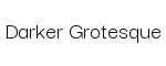

"Two modern grotesques with editorial and news-app backgrounds."
Bricolage Grotesque vs Familjen Grotesk

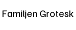
"Two expressive grotesques from the new wave of variable fonts."
Condensed & Narrow
Barlow Condensed vs Encode Sans Condensed
"Two versatile condensed families covering the same design territory."
Roboto Condensed vs Source Sans 3

"Condensed workhorse vs. its close uncondensed equivalent."
Saira Condensed vs Cabin Condensed

"Two narrowed humanist sans-serifs with similar use cases."
Fjalla One vs Squada One

"Both are bold condensed display fonts often used in strong headlines."